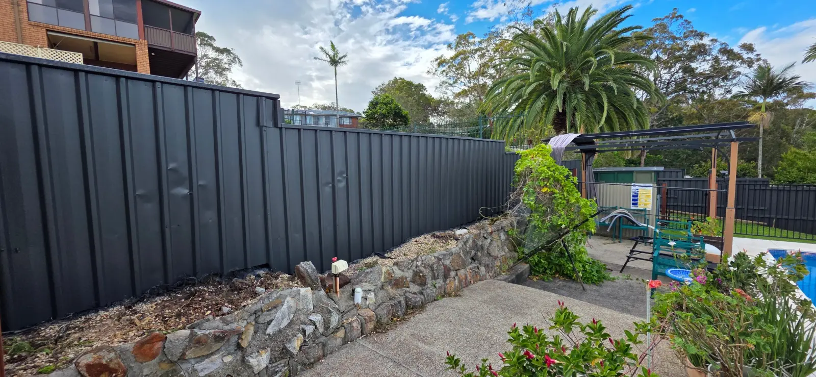

EXTERIOR COLOUR SHORTLIST
Ten exterior paint colours to compare with your home’s fixed finishes.
The right colour works with the roof, brick, windows and paving you plan to keep. Use this evergreen shortlist to narrow your options, then test the actual paint at home. These are suggestions to explore, rather than a national popularity ranking.
Explore: Ten colour cards · Colour roles · Sample testing · Paint suitability
Start with the materials you are keeping
Write down the roof, gutters, window frames, face brick, stone and paving that will remain. Put physical samples beside these materials wherever possible. Choosing a wall colour in isolation can leave you with a trim or roof combination that feels unresolved.
If you are choosing an entire scheme, our exterior colour-combinations guide shows how to work with retained brick, roof and gutter colours. This page focuses on individual colours you can shortlist.
Ten colour references worth sampling
The swatches below are digital guides. Screens, photography, surface texture and sheen affect their appearance. Order the manufacturer’s physical samples before deciding. COLORBOND® names identify steel colour references; a paint mixed to coordinate with one is a separate coating, not a factory COLORBOND® finish.

01 · COLORBOND® colour reference
Surfmist®
A pale starting point for a light exterior scheme. Compare it with the fixed roof, window frames and mortar before choosing other whites; closely related pale colours can look mismatched when placed together.
How to assess it: Try as a pale reference beside retained metalwork, then approve a painted sample in your chosen product.

02 · COLORBOND® colour reference
Shale Grey®
A lighter grey direction for customers who want a quieter contrast than charcoal. Put a sample beside warm brick or terracotta before committing: the surrounding materials can change whether the scheme feels balanced.
How to assess it: Compare with a soft trim colour and a single darker accent rather than adding several unrelated greys.
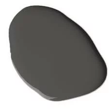
03 · COLORBOND® colour reference
Woodland Grey®
A deeper reference to consider when you want stronger edges or continuity with existing dark metalwork. Test it against garden planting and the roof, rather than judging a small chip on a white screen.
How to assess it: Start with a limited area such as a suitable door or trim. Check any substrate restrictions on dark colours.

04 · COLORBOND® colour reference
Deep Ocean®
A blue direction for an exterior accent. It can give the entrance a distinct role without changing every surface. Compare the proposed paint with the actual roof or metal sample if you are coordinating existing COLORBOND® steel.
How to assess it: Trial as one accent within a restrained scheme; a shared colour name does not guarantee an identical finish across materials.
05 · Haymes Paint
Awe Inspired
Haymes describes this as a deep blue-green, close to teal, and suggests it for an exterior front door. It is a useful option when you want a coloured accent rather than another neutral.
How to assess it: Test with pale surrounding walls. Haymes suggests Light Stone and Quarry Grey as colours to explore alongside it.
06 · Haymes Paint · 55807
Bushland
A warm, earthy direction for a scheme that already includes timber, stone or warmer paving. This is the Haymes colour, not the similarly named colour from another brand.
How to assess it: Check a sample against the actual brick and roof. Avoid assuming that every earthy colour will suit every warm-toned facade.

07 · Wattyl
Everest Peak
Listed within Wattyl’s cool-white collection, this is a white to compare when you want a cleaner, cooler direction. Check it beside existing cream windows or warm stone so those retained finishes do not become an afterthought.
How to assess it: Compare a large sample on both the bright and shaded sides of the property.

08 · Wattyl
Shimmer Dolphin
Wattyl uses this colour in an exterior cladding example with tonal contrast. It gives you another grey direction to assess without claiming one grey works on every house.
How to assess it: Test beside the fixed roof and paving, then decide whether the trim should blend or contrast.

09 · Wattyl · Heritage collection
Powder Rose
A colour to explore when you prefer a rose-toned accent over a neutral entrance. Start with a small, clearly defined element rather than assuming a whole pink facade is the right solution.
How to assess it: Compare with existing warm masonry and test the actual colour. For a heritage property, check the relevant requirements before changing the scheme.
10 · Taubmans · TTC TIM 13
Bushland
Taubmans identifies this as an earthy, mid-strength colour. It offers a different warm direction from Haymes Bushland; the names are alike but the colour references are not interchangeable.
How to assess it: Use the full brand and colour reference when ordering samples and recording the final schedule.
Give each colour a clear role
- Main painted area: the largest wall or cladding colour needs to sit comfortably with the retained roof and masonry.
- Trim: decide whether eaves, fascias and posts should blend with the walls or create a deliberate outline.
- Accent: use a door or another limited feature to introduce a stronger colour without adding visual clutter.
There is no rule that every surface needs its own colour. Repeating one reference across selected elements can create continuity, but the materials may reflect light differently. Confirm which surfaces are included and which will stay as they are.
Test two or three finalists on the property
Compare larger samples rather than trying to choose from dozens of small chips. Place each beside the actual brick, roofline and windows, and view it in sun and shade at different times of day. Move a sample board around the house if access allows.
Check the whole combination from the street as well as close up. A sample that looks pleasing on its own may clash with an orange brick, a cream window frame or a cool grey paver. Keep notes on why you prefer one combination, then approve the final colour and sheen together.
Choose the correct paint system after choosing the direction
A colour name is not a coating specification. Timber, render, masonry and previously painted metal can require different preparation and products. Procover uses Haymes, Wattyl and Taubmans; the exact system depends on the inspected surface and exposure.
For dark colours, check the cladding or substrate manufacturer’s colour and heat restrictions before approval. Do not use a roof colour’s solar-performance figures as evidence for a different paint on a wall. Ask for advice on the actual material and product.
What to send with your exterior quote enquiry
- A photo of the full facade plus close-ups of the surfaces to be painted.
- The finishes staying in place, including roof, brick and window colours if known.
- Two or three colour references with brand names, rather than a screenshot alone.
- Any access constraints, damaged coating or repairs needing assessment.
- Which surfaces you want included, and whether you need help finalising samples.
Common exterior-colour questions
What is the best exterior colour for an Australian home?
There is no single best option. Start with the materials you are keeping and the appearance you want, then compare a small number of real samples. A useful shortlist is more valuable than following a colour solely because an article labels it fashionable.
Can the same named colour look different on different materials?
Yes. Sheen, texture, lighting and the coating itself can change its appearance. If matching a painted door to existing steel or powder-coated windows, approve a physical comparison before painting everything.
Should I repaint my brick to make the scheme work?
Consider whether a change to trims, painted cladding or the front door can resolve the scheme while leaving face brick intact. Painting masonry creates a separate preparation and maintenance decision; it should be assessed rather than assumed.
Plan your exterior repaint with Harry
See our exterior painting service and request a quote with photos and your shortlisted colours. For properties around the lake, our Lake Macquarie exterior-repaint guide covers inspection and planning.
Colour references
References checked against Haymes Awe Inspired, Haymes Bushland, Taubmans Bushland, Wattyl’s Heritage collection, Wattyl’s white and neutral references, Wattyl’s exterior example and the COLORBOND® colour range. Pairing suggestions are starting points to sample, not guarantees of a match.